Keep on truckin’

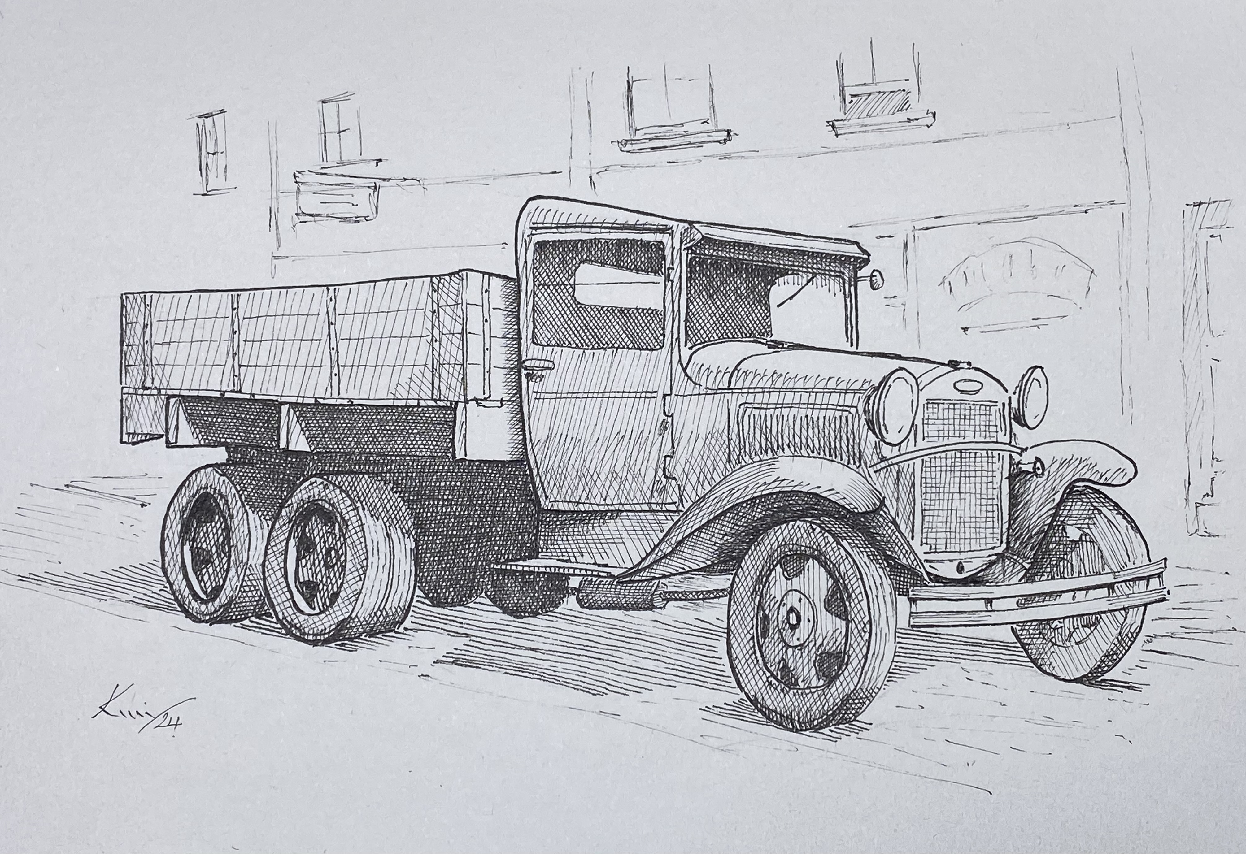
Well, it’s a good excuse to do something other than those soft, flowing, organic lines in the flowers. Here we have some good old, sturdy, straight lines and sharp angles, and plenty of hatching.

I liked the look of this 1920s style truck and thought it deserved sketching. It’s not quite old enough to have moved the Clampetts* to Beverley Hills, that was, apparently, a customised 1921 Oldsmobile 43-A roadster. I added a loose background for a little context. Completed with fine liners in my sketch book.

What do you think?

(*As in the ‘Beverley Hillbillies‘ American TV sitcom, 1962-1971)

Wild Rose

Just how wild can a rose get? I’m still experimenting with hatching instead of stippling, and this is the latest attempt.

I’m pleased with the overall effect, but there is work to do. Hatching takes more planning than stippling, you have to know where you are going, whereas with stippling you can build the tones and textures has you go.

More layers are needed to get greater tonal variation, and I need to try different subject matter.

There will be more …

A Rose … by any other name

This is, again, from my sketchbook. I have reverted to stippling for this one. I felt that hatching could be a little harsh for such soft shapes and shading.

It reminded me just how slow the stippling process is. It is a very mindful process, inasmuch as I can lose myself in the actions – just watching the form appear before my eyes. I think this one took may be 10 hours.
I start (after laying out the shape in pencil) by laying down mid-tone areas, leaving the highlight areas untouched. After that, I gradually add more dots to increase the tonal value – working one area/petal at a time.

Once I’ve finished all areas I review the whole piece and add any more if required. As with most art, the secret is knowing when to stop.

The sketchbook is a cheap one and the paper does not lend itself quite so well to the stippling technique. It is soft and quite absorbing – almost like blotting paper. This does give a soft, etherial look to the rose, but I felt a little lining was needed just to define the edges.

The leaves were a learning exercise. In order to make them fit with the rose they had to be more life-like.

Let me know what you think.

Note to self: Invest in a better quality sketchbook!

Architectural Scroll

Another page from my scrap book, an architectural scroll. I started by shading the outside with stippling.

Usually I would complete the whole picture with stippling, but this time I used hatching. The lines follow the contours and enhance the 3D effect.

I wasn’t sure if the mix of stippling and line was going to work, but I am pleased with the finished work.

Using the hatching technique is very different from stippling, even though the final aim is the same – to have a tonal finish that gives the impression of highlight and shadow, a convincing 3D effect.

With stippling the varying tone across an area can be built gradually until the desired effect is reached. Hatching and cross hatching requires more planning, but is quicker to execute. Stippling has a softer appearance overall, and different subjects lend themselves to a particular finish.

I used UniPin 0.05 fine liner.

What’s next, I wonder?

Hatching … a plan?

Cross hatching - a peony

Continuing with my sketchbook at our Tuesday art gathering, I experimented with hatching, as opposed to stippling, for creating shape and texture in ink drawings.

I took my inspiration from old school techniques, as found in illustrated text books of the 50s and 60s, and a couple of modern ink artists.

The basic idea is for the lines to accentuate the form, creating the illusion of three dimensions, shading, and texture. One layer is called hatching, but the more layers added in different directions – called cross hatching – the more the shape is defined.

I chose to draw a peony this time. I used a 0.05 fine liner by Uni Pin.

I started with the flower. The difficulty here was to show tone, yet still have sufficient variation to give form. The leaves were simpler as they are not the main focus for the drawing. Lastly I added shadows. The principle is that shadows are darker the shaded areas, so hatching in four directions was necessary to get the required definition.

I am pleased with the image, it is dramatic with plenty of contrast. I shall be using this technique again. What do you think?

Sketchbook Doodle

Among all the other things going on at Christmas, I found time for a dotty doodle in my sketchbook.

Once a week we go to a friend’s studio for a chat and the opportunity to spend time with other arty-crafty people. While we are there we can work on a project or just chat. I usually doodle a flower or some other shape from nearby inspiration. This time I chose a tulip. When I’d finished I added the bee just because …

Experiment

I wanted to experiment with shadows, highlights, and reflections, and what better to work on than a vintage brass oil lamp with a glass globe.

I used a variety of marks. I started with hatching lines on the body, but as I needed more gradual shading I reverted to stippling. I finished with a little graphite.

I’m pleased with the result – what do you think?

Scotney Old Castle – again

Back in March of 2023 I drew part of Scotney Old Castle, from the front. This view is from the other side – the lake side.

Scotney Old Castle, in Kent, was built around 1380, as a fortified house with a tower at each corner, but it is believed it was never completed, and by 1558 only the south tower remained. In 1580 the south wing was rebuilt in Elizabethan style. It, together with the New Castle in the same grounds, belongs to the National Trust.

Drawn with fine liners with graphite shading.

Wedding card – a bit different

Well, the wedding was a huge success. The dress, the suit, the ceremony, the event location, and the people were all great. The whole thing was organised by the bride, and she excelled over what a wedding planner could have done.

Of course I needed to come up with a handmade card for the occasion, so the couples attachment to the macabre made it easy. So, here is the design for the card – to compliment the table decorations …

West Dean, West Sussex

While we were away cat sitting we took a trip to West Dean Gardens. These are the grounds of West Dean College, where we found this building in the walled kitchen garden. It seems to be a drying room for flowers/herbs/vegetables.

Pen on Bristol board, graphite shading. A4